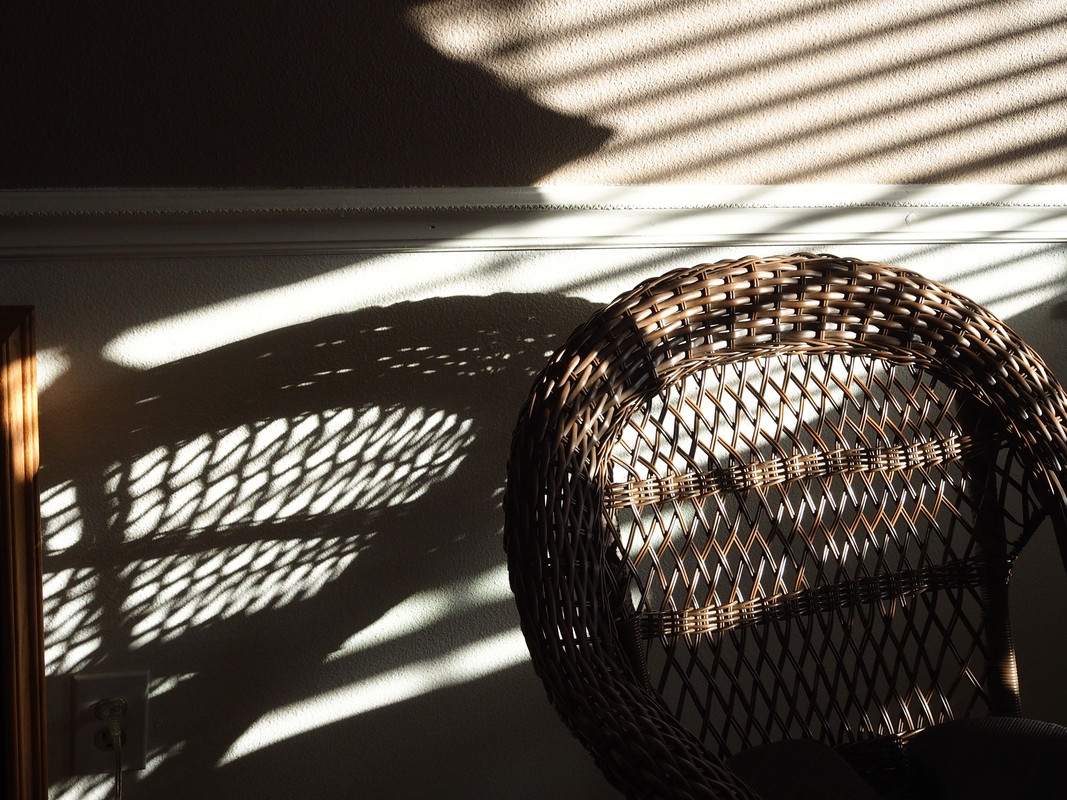
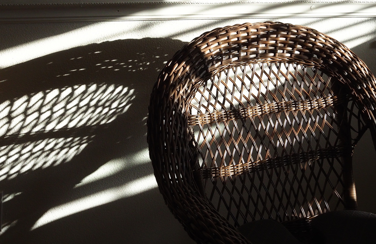
Welcome to DU! The truly grassroots left-of-center political community where regular people, not algorithms, drive the discussions and set the standards. Join the community: Create a free account Support DU (and get rid of ads!): Become a Star Member Latest Breaking News Editorials & Other Articles General Discussion The DU Lounge All Forums Issue Forums Culture Forums Alliance Forums Region Forums Support Forums Help & Search

George McGovern

(9,544 posts)
Sat Jun 28, 2025, 02:46 PM Jun 2025

Wicker Chair Shadow -- Can't decide--do you like one or the other, or both or neither? Thanks!


34 replies = new reply since forum marked as read
Highlight: NoneDon't highlight anything 5 newestHighlight 5 most recent replies
Wicker Chair Shadow -- Can't decide--do you like one or the other, or both or neither? Thanks! (Original Post) George McGovern Jun 2025 OP
I like 2. FalloutShelter Jun 2025 #1
I missed that! EarthAbides Jun 2025 #5
That does make sense FalloutShelter. Thanks! Then again confusion is my normal . . . George McGovern Jun 2025 #8
Second one EarthAbides Jun 2025 #2
Thanks EarthAbides. Really like your username! George McGovern Jun 2025 #10
I like the top one. Not taking up so much of the frame Tadpole Raisin Jun 2025 #3
Thanks Tadpole Raisin. I tend toward perspective. I appreciate yours. George McGovern Jun 2025 #11
Thx! I was photography and layout editor in college and Tadpole Raisin Jun 2025 #14
Thank You Tadpole Raisin! You still have a good eye. Do you take many pictures? George McGovern Jun 2025 #17
I like the light and dark contrast in the second one. mwmisses4289 Jun 2025 #4
Thanks mwmisses4289. Light and dark can contrast nicely. Waxing philosophically, George McGovern Jun 2025 #12
This is where I come down, too. ShazzieB Jun 2025 #22
Thanks ShazzieB. George McGovern Jun 2025 #23
Love them both! Easterncedar Jun 2025 #6
Thanks Easterncedar! Your viewpoint encompasses my indecision. I welcome your elegant comment. George McGovern Jun 2025 #13
Second. usonian Jun 2025 #7
Thanks usonian. I like your non-ambivalence. George McGovern Jun 2025 #15
Second one.... anciano Jun 2025 #9
Thanks anciano. For looking and evaluating. George McGovern Jun 2025 #16
I like both but I think I am leaning toward #2. I like the brown/white stripes on the first one LoisB Jun 2025 #18
Thank You Lois. Well, if you get tired of leaning, feel free to sit down in the chair . . . George McGovern Jun 2025 #19
LOL! Folks, George will be here all week; don't forget to tip your waitress. LoisB Jun 2025 #20
1st 1 is a more interesting composition. mopinko Jun 2025 #21
Thanks mopinko for viewing and replying. George McGovern Jun 2025 #24
I think I like the second one better George. Diamond_Dog Jun 2025 #25
Thanks Diamond_Dog! George McGovern Jun 2025 #28
#2 is a better visual. In the first pic, the top left triangular shadow is a distraction. DUU Jun 2025 #26
Thanks DUU. I appreciate your opinion. George McGovern Jun 2025 #30
Focus on the chair and shadow... GiqueCee Jun 2025 #27
Thanks so much GiqueCee. I think most everyone agrees with you. George McGovern Jun 2025 #31
Definitely the second one. Phoenix61 Jun 2025 #29
Thanks Phoenix61. I value your view. George McGovern Jun 2025 #32
george, I like the second image better than the first (image) wyn borkins Jul 1 #33
Very worthwhile suggestions Wyn! I'll keep your reply window open for quick reference. Thanks!! George McGovern Jul 1 #34

FalloutShelter

(13,831 posts)
1. I like 2.
Sat Jun 28, 2025, 02:55 PM
Jun 2025

I like it better because the piece of wood trim on the left is cropped out. I think that the trim and its' shadow confused the geometry.
If that make sense.

Tadpole Raisin

(1,889 posts)
14. Thx! I was photography and layout editor in college and
Sat Jun 28, 2025, 03:57 PM
Jun 2025

was always fascinated by perspective in a shot. Although it’s been years I’m still drawn to not just the item shot but the relationships within the frame.

I appreciate your artistry!

mwmisses4289

(2,320 posts)
4. I like the light and dark contrast in the second one.
Sat Jun 28, 2025, 02:56 PM
Jun 2025

Too much dark in the first one for me.

They are both beautiful pics, though.

George McGovern

(9,544 posts)
12. Thanks mwmisses4289. Light and dark can contrast nicely. Waxing philosophically,
Sat Jun 28, 2025, 03:47 PM
Jun 2025

"too much dark" may not be an especially good thing in life.

ShazzieB

(21,666 posts)
22. This is where I come down, too.
Sat Jun 28, 2025, 08:28 PM
Jun 2025

Last edited Sat Jun 28, 2025, 08:58 PM - Edit history (1)

Both are interesting to look at, but in the end, my eye is more drawn to #2.

Easterncedar

(4,959 posts)
6. Love them both!
Sat Jun 28, 2025, 02:59 PM
Jun 2025

I thought I preferred one, then looked harder and can’t decide. The strong parallel lines above versus the brighter basket weave below…. Oh those elegant details!

George McGovern

(9,544 posts)
13. Thanks Easterncedar! Your viewpoint encompasses my indecision. I welcome your elegant comment.
Sat Jun 28, 2025, 03:53 PM
Jun 2025

usonian

(20,878 posts)
7. Second.
Sat Jun 28, 2025, 03:34 PM
Jun 2025

Big dark area and slats dominate the first.

Nondescript composition. Two pictures in one.

Second is "focused." and has diagonal composition.

LoisB

(11,707 posts)
18. I like both but I think I am leaning toward #2. I like the brown/white stripes on the first one
Sat Jun 28, 2025, 05:49 PM
Jun 2025

but maybe that takes the focus off the chairs a little. At least to my ancient eyes.

George McGovern

(9,544 posts)
19. Thank You Lois. Well, if you get tired of leaning, feel free to sit down in the chair . . .
Sat Jun 28, 2025, 06:43 PM
Jun 2025

Diamond_Dog

(38,589 posts)
25. I think I like the second one better George.
Sun Jun 29, 2025, 09:02 AM
Jun 2025

Something about the wall space above the chair and shadow in the first one doesn’t work as well for me as the bottom photo.

Pretty neat capture!

GiqueCee

(2,854 posts)
27. Focus on the chair and shadow...
Sun Jun 29, 2025, 09:10 AM
Jun 2025

... the shadows above the chair rail are extraneous and distracting from the superior composition below.

Phoenix61

(18,559 posts)
29. Definitely the second one.
Sun Jun 29, 2025, 10:51 AM
Jun 2025

The dark at the top left corner draws your attention away from the chair and its shadow.

wyn borkins

(1,372 posts)
33. george, I like the second image better than the first (image)
Tue Jul 1, 2025, 02:25 AM
Jul 1

I also suggest (a possible) re-shoot to improve composition and lighting

(1) Raise window blinds to eliminate extraneous horizontal shadowing

(2) Add more chair (in frame) to improve rationale for overall (chair/shadow) image effect

(3) Focus on chair and it's reflection on backwall with millwork. Your second image nicely displays chair just below millwork and decent amount of wall area just above millwork

(4) Perhaps reposition chair in incoming light for improved chair/shadow effect

(5) For a different presentation, maybe try to focus on the shadow while leaving the chair in slight blur

These are only suggestions - only suggestions - only suggestions. Your friend, Wyn

Latest Discussions»Culture Forums»Photography»Wicker Chair Shadow -- Ca...